Creating analytics content for your colleagues, customers or partners is a long journey. The analytics should provide the insights the users need, use the right visualisations and display the content in an attractive way for the end user.
This blog will show you how to customize your reports and dashboards to make them more attractive for your users. Whether you are a long-time BellaDati user or you just started with BellaDati Platform, you will certainly find many customization options which will help you to customize your BellaDati content.
Use color schemes
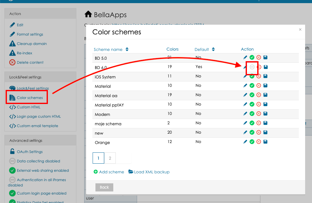
BellaDati color schemes are a great way to customize the colors in reports and dashboards to fit your needs. You can set a default color scheme for your domain or select a specific color scheme for each view (in the view settings):

The default color scheme can be selected in the domain administration:
Define custom members appearance
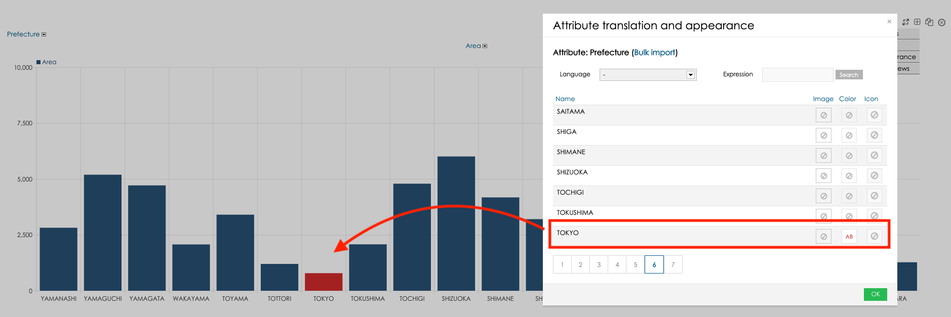
Each BellaDati attribute member can have defined its own color which will be applied in all appearances of this attribute member. Let’s have an attribute Prefecture. In case the prefecture is Tokyo, the value should always be red. This scenario is supported by the member appearance color. You can set the member appearance in the data set attribute settings or in the drill-down advanced settings:
Use custom navigation components
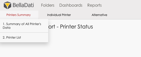
It is useful to enable custom navigation menus which allow the users to access the list of reports from any BellaDati screen. The users can then focus on the important tasks without the need to search through all available content. The navigation menu can be displayed inline with the standard menu:

Or as hover menu:
You can download your custom menu extension from the BellaDati Marketplace.
Customize the indicator colors
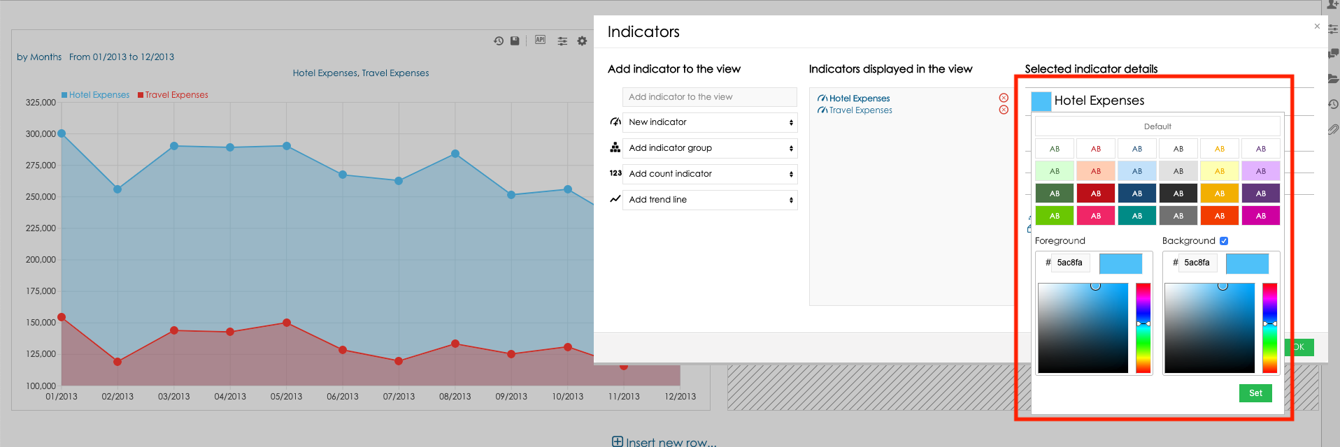
The color of each indicator can be changed in the in the indicator settings, line chart can also display different colors for line and background:
Use custom shapes of KPI labels
Custom shapes together with the custom colors will enhance the user experience for all the users. You can set the KPI label shapes in the Indicator appearance settings:

Combine custom context and dynamic values in the custom content views
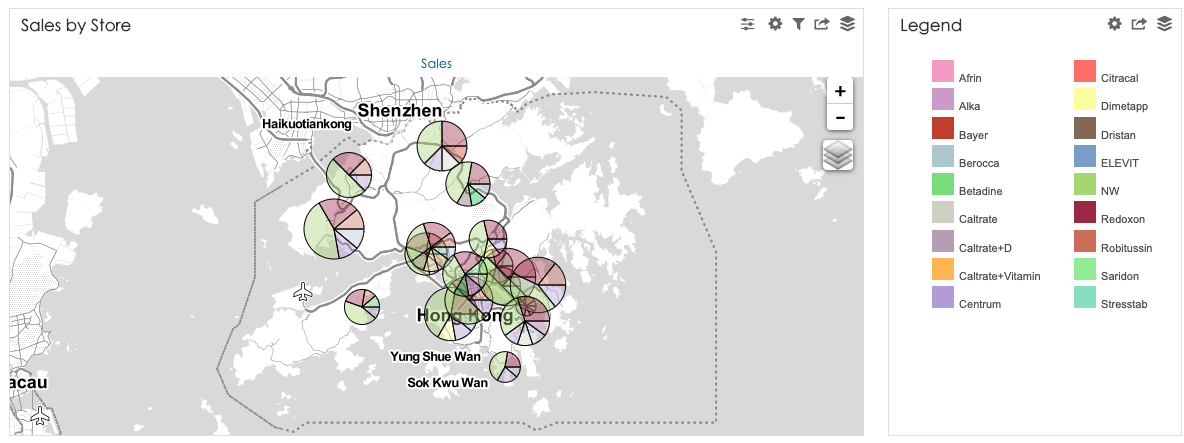
One of the BellaDati view types is the custom content view. Custom content view allows you to include text, iFrames or custom HTML into your reports and dashboards. The custom context can visualise a legend for your map:
Or a description for your report:

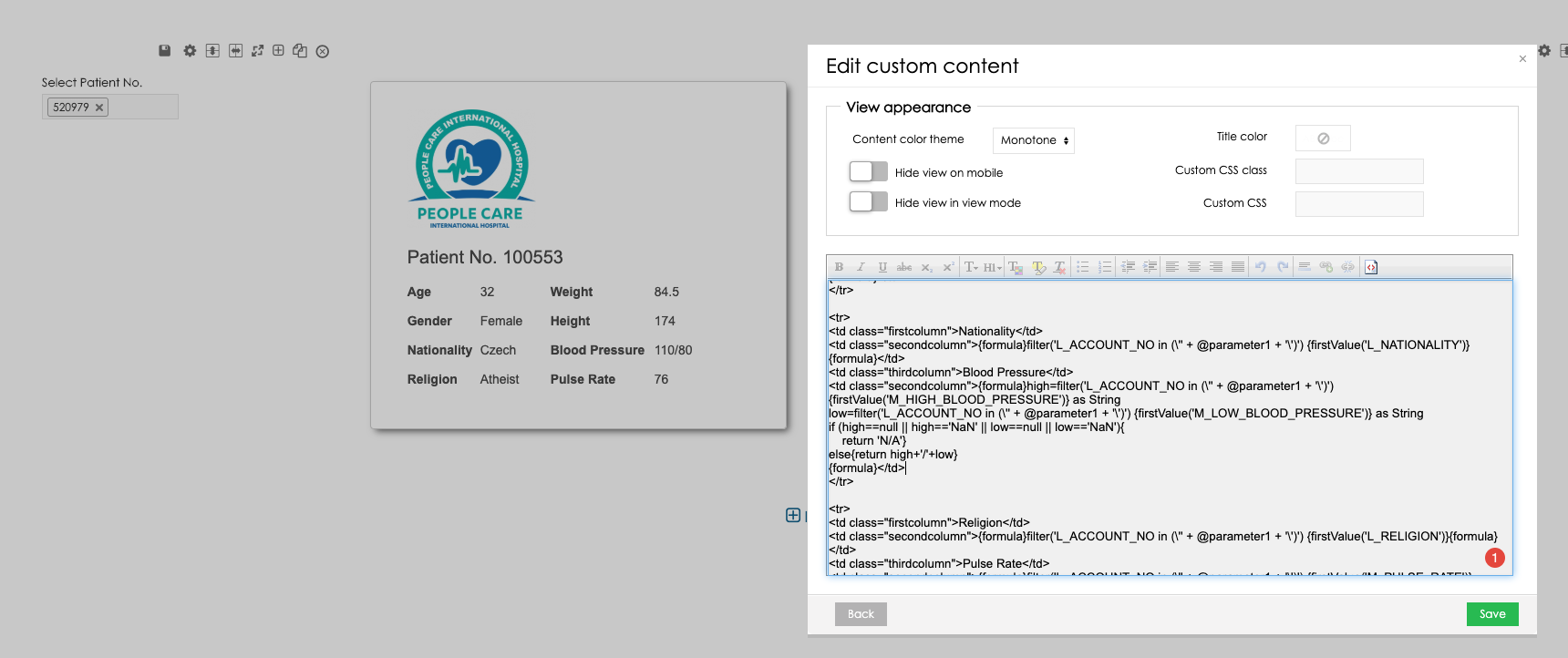
The custom context can be also enhanced with the formula macros or your own HTML/CSS to create custom report components with dynamic values. See the below example with the patient card:
Hide unnecessary report components
In case you want to keep your reports clean and do not want to overload the users with too many report components, you can hide these components in the report appearance.
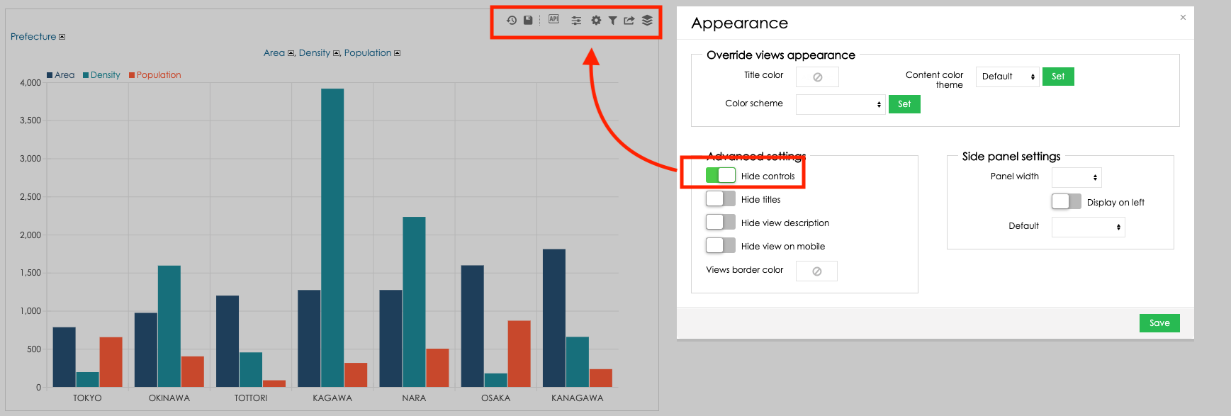
The option Hide controls will hide the controls displayed in each view – these controls will only be available in the Edit mode:
The option Hide titles will hide titles of all the views in the report:

The option Hide view description will hide the drill-down name, date time interval settings and filter settings in all views in the report:

You can also change the border color based on your preferences. Changing the parameter Views border color to white will hide the view borders:

Use BellaDati extensions with custom renderers
BellaDati Client API allows you to use the custom renderers for charts and tables with a fully adjusted layout based on your preferences. Try out the BellaDati extensions for tables

Develop your own custom BellaDati renderers
If you would like to implement your own BellaDati renderer, check out the video from the related BellaDati webinars:


